Store-it Design Sprint
Workshop Manager – Interaction Design – Wireframes – Prototype – User Testing
The problem we were solving
The number of customer service calls had increased to undesired levels. Store-it wanted to know the main reason for the calls and a solution for it.
Assembling the Team
The sprint team had the following members:
- Store-it – Technical Director
- Store-it – Location Manager Amersfoort
- Diamond Security – Technical Director
- Diamond Security – Project Manager
- CA Software – UX Designer (that would be me!)
- CA Software – PHP Developer
Both technical directors were appointed as decision makers.
The Diamond Security project manager acted as facilitator.
Defining the Problem
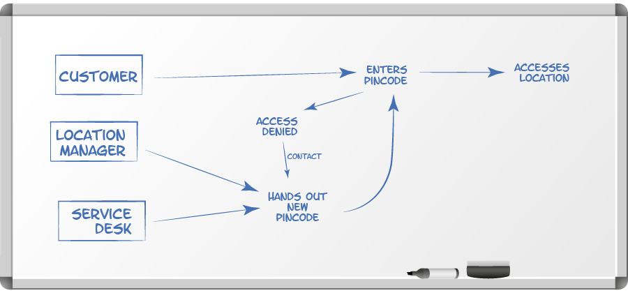
First we mapped out the process and its different players, so we had a good understanding of what was going on.
A bit of research taught us that the majority of service calls could be linked to the following problems:
- The customer had trouble accessing the building,
- The customer had entered a wrong entry-code and was denied access,
- The customer had forgotten their entry code,
- The customer tried to enter the building outside operating hours (06.00 – 23.00).
Turning Problems into Questions
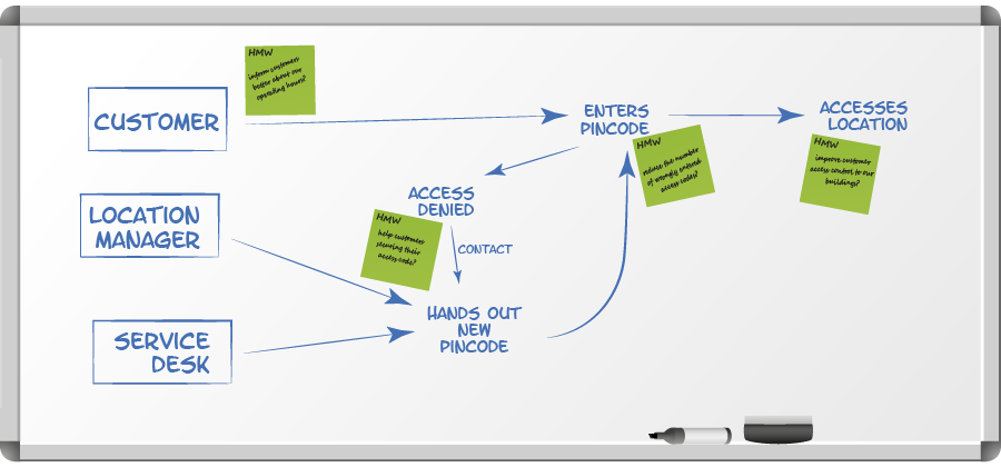
The problems were transformed into HMW (How Might We) questions:
- HMW improve customer access to our buildings?
- HMW reduce the number of wrongly entered access codes?
- HMW help customers securing their access code?
- HMW inform customers better about our operating hours?
Sprint Target
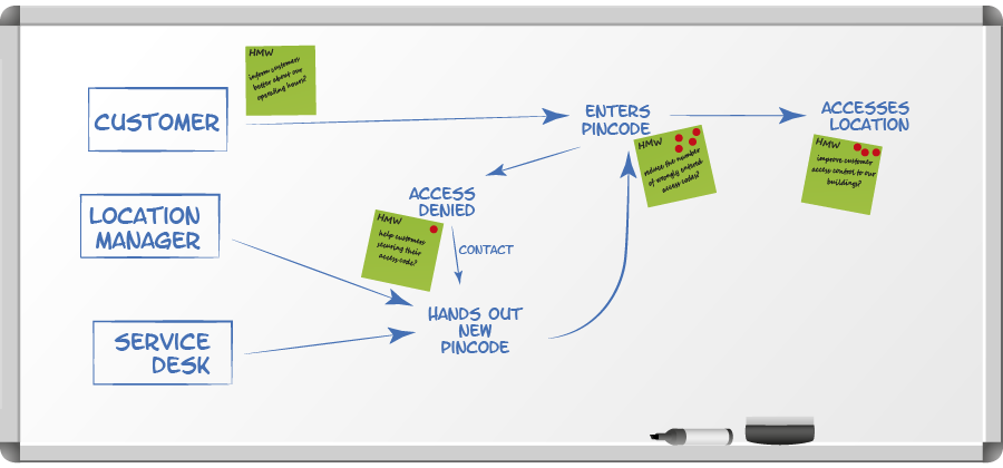
After we took a vote on which of these was the primary target for our sprint, it became clear the biggest gain would be made if we could reduce the number of wrongly entered access codes.
Thinking about Solutions
How could we reduce the number of wrongly entered access codes?
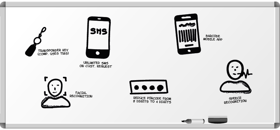
Some of the ideas that came along were:
- Reduce the number of digit from eight to four.
- Drop the pincode altogether and use facial recognition.
- Use speech control for entering the access code.
- Use a transponder key to control access.
- Allow customers to request their pincode by SMS as often as they want.
- Use an app to store the pincode as a barcode / QR-code and install scanners.
- And quite a few more.
It became clear the barcode mobile app was the favorite of both decision makers, so the team decided to move forward with this idea.
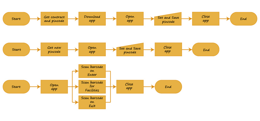
Flowcharts of the User Stories in preparation of the Prototype Build
For this neat little app we needed to include three user stories:
- As a CUSTOMER, I want to GAIN ACCESS TO THE LOCATION so that I CAN GET TO MY BOX.
- As a CUSTOMER, I want to CHANGE MY PINCODE so that I CAN GAIN ACCESS.
- As a CUSTOMER, I want to CHANGE MY LOGIN DATA so that I CAN PROTECT MY ACCESS CODE.
Sketching the Wireframes
It was obvious that this would not be the most difficult application we ever designed.
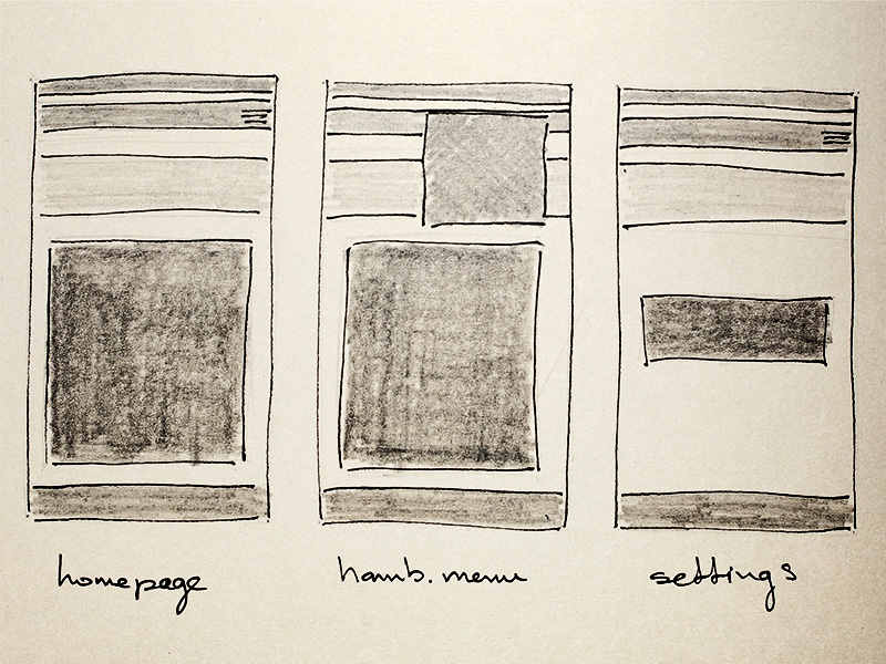
The three wireframes shown are (from left to right):
- The Homepage – showing a navigation bar, logo, space for the QR-code and a bottom navigation bar.
- The Homepage with a Hamburger Menu opened.
- The Settings Page – essentially the barcode area becomes a text area to fill out the actual pincode.
Building and Testing the Prototype
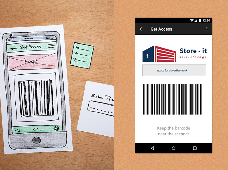
We took our prototypes to one of the Store-it locations to see how customers would react to using the app.
We asked 10 people to enter through the main gate and 5 more to enter through the normal entrance.
Each of the 15 participants was “treated” to a five-act interview:
- A friendly welcome in which we explained the issue at hand,
- A series of open-ended context questions about the customer,
- Introduction to the prototype,
- A detailed series of tasks to test the functionality,
- A quick debrief and review with the customer about his/her impressions and experience.
Improvements
Even though this mobile app was simple by design, the first test revealed a few things we could improve.
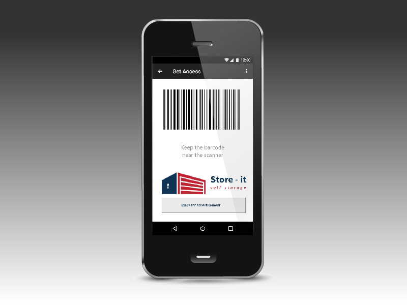
One issue was the positioning of the logo and the barcode. As the barcode had to be held under the scanner, having it below the logo did not work that well. So, we went back to the “solutions” stage and made a second iteration in which we put the branding at the bottom of the screen and the barcode at the top.
While putting this through the test phase, we got quite a few reactions like: “When will we be able to use this app?”
That told us we were ready to put the app in production.

