Website Design for Flight school Dwarf
UX Guidelines – Design Framework – Interaction Design – Content Strategy – SEO
Introduction
While on a weekend away in England with a group of fellow pilots, I had the following conversation with my former instructor and flight school owner Cees:
“Don’t you believe in a digital footprint?”
“Of course I do…”
“You current site tells a different story?”
“I know, but I don’t know anything or anybody who could help me, who can I trust…?”
“You got me, ain’t gonna get much better than that…!”
And so it transpired that I was going to build yet another website. It had been a while… too long I would even say. Certainly in hindsight I can safely say that I missed this. The last 5 – 6 years have been filled with huge projects, mostly commercial software products for international clients, which are interesting enough, but I did look forward to go back to the basics. Build a website that can compete in targeted search results, for a specific audience ((soon to be) student pilots), and mainly in a specific region (Hilversum airport and its surroundings).
Were my content skills still up to par? What had changed over the past decade? Can we still do things just that little bit different to get better results?
Turned out to be a pretty interesting project. I had (and still have) a blast of a time.
So, why not include it in my portfolio? Doesn’t matter this is a side-project. I still treated it with full professionalism and it is showing an above expectation ROI.
Let’s see…
(Note: the website image are snippets and cropped to illustrate a point… they do not represent the full width design)

Explore the field
What are we up against? Where are other flight schools at, regarding their websites?
Most of them are ‘just publishing’ their presence. Clean, informational, contact form, done. At aerodrome Hilversum there is a second flight school and they are doing things a lot better. Their biggest advantage of course is that they have the location embedded in their name. That will be tough to beat.
Their approach is quite commercial though. Charging money for a checklist? Is that good idea? Anyone can take pictures of the checklist in the plane. So, why would they pay for that? Why not offer these (unofficial) copies as a free download and put some branding on them? Use such items for better SEO results and traffic.
Asking the Right Questions
Next up, what are the most important things for Flight school Dwarf?
- What is the core revenue generator? Lessons? Rentals? Tours & Events?
- Turned out the most important thing was lessons, so student attraction.
- Both rentals and the organisation of trips and such were very minor for the business.
- What is your preferred method of communication? Phone? Email? Online form?
- No question, it’s the phone. Direct communication works best to talk to potential students.
Alright. Makes perfect sense. However, from a content perspective, what are we looking for:
- You want separate landing pages for all your courses, so they will be indexed and found independently.
- You want to offer some content that is interesting for non-student visitors, to increase traffic.
- You want to include links to external sources, as this will convince crawlers you are providing web-content beyond your own stuff.
- You want social engagement through, for instance, student quotes, to show that you are trustworthy.
- You want to offer downloadable content, if possible of a rather unique something, to make you stand out from all the others.
- You want to appear open, approachable, human… get away from the clinical information style. Students should feel comfortable taking lessons from you.
With all that in mind, how did we proceed?

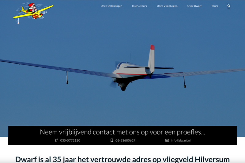
Contact Us Differently
Normal practice is to include a Contact Us page in the main navigation. In many cases this offers some address information and a contact form.
But here, we went for a more open approach. You want to lower the contact barrier as much as possible and be easily accessible.
The image shows the top of the homepage. Right there are three main means to contact Dwarf immediately. Two phone numbers and an email. Of course, on mobile devices, tapping any of them would either call the number, or open you email client right away. This contact block pattern is repeated on every page where the visitor could be ready to contact the flight school.
Circular Navigation
Traditional hub-and-spoke architecture is used on millions of websites and one can make an argument for using it as well on this one.
However, listening to conversations with potential students, during intakes at the flight school, made it clear that many are still not sure which license to get, and float from one to another trying to make up their mind. We try to mimic, or facilitate, this behaviour by allowing the visitor, when on one of the course detail pages, to switch to any of the other ones with one click, hereby creating a circular flow. This also helps when a visitor enters the site from a search engine at one page, but wants to move quickly to another without having to figure out the main navigation.
Here one can also see how we use student quotes as a means to install and confirm trust in flight school Dwarf. Shown is the homepage, and this is repeated on the instructor page and the overall our courses page, all with different quotes of course.


Reduced Navigation
This is the bottom part of the RPL course page. Once again we see the contact block and direct access to other courses if this is not what we were looking for.
And we also provide direct links to other content that could be of interest at this stage for the wanna-be pilot.
- A link to the pricing page, which is part of the About Dwarf page. Of course the link scrolls to the correct area of the page.
- Links to aircraft detail pages, for those aircraft in the fleet used for this course.
No need to scroll up or down to find a menu (both header and footer menu are present). Direct navigation lowers the threshold.
Don't be Afraid
When appropriate, provide links that will take the visitor away from your site. I know, I know, a marketeer’s nightmare, but it is nothing to be afraid of.
First and foremost, it increases the value of your page for search engines. The crawlers realise your pages are not dead-ends, they can move on and they like that.
Well, actually, this also goes for your visitors. Many people ‘search’ the web and if your site leads them to their final goal, they will remember that. We will also see this at our “Dwarf Tours” pages, which are filled with links to the airfields we visit and other useful material for those who want to make that same trip. Visitors will remember this and they could start bookmarking your site as a source of information. This means… they will be back!
Oh, and please, no! Don’t open these pages in a new tab!! Allow the user to return using the obvious back button every browser offers.
Another source of information can be seen here. Aircraft specific documents. POH, checklist, SkyDemon profile, Weight & Balance, Training Material. It’s all there. Why not? As long as you state clearly that the Pilot in Command is responsible for using the official documents found in the plane, offering these for reference will make the site a resource. Think a bit broader here… all those sim-pilots could also use these documents and that generates additional traffic. Can’t hurt, now can it?
And yes, it is ok to open these PDF files in another tab, as these are not part of the browsing experience, but separate document files. Context and details matter.


Content is King!
Even though the client indicated that Dwarf Tours only is a small part of his business, it offers interesting possibilities for his digital footprint.
It gives us the chance to offer quality content, without direct commercial purpose. Stories… and who does not love good stories, especially pilot ones! Along with the stories comes the opportunity to offer links to interesting places and free contextual downloads.
This, of course, will always be ‘work in progress’, and its content ever growing. It does require some effort, but should provide a decent return.
The optimal goal being that instead of the flight school having to ask if people are interested in a trip, students starting to ask: “When is the next trip to Leer-Papenburg??”
When that happens, I know I deserve a piece of cake…