To err is human and how we need to deal with it
The happy flow. Ah, yes, we all know how to do that. Nice, easy to accomplish and very satisfying. Unfortunately, from a UX and usability perspective, by far the least interesting of flows.
While “to err is human”, the design of systems, both technical and social, has substantial impact on the rate and severity of errors.
The Interaction Cycle
To understand the need and impact of good error handling, we first need to understand the interaction cycle.
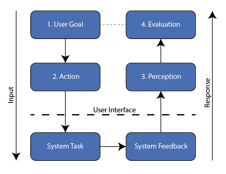
Every time a person interacts with a system, or apparatus, that person goes through a series of thoughts, expectations, and actions.
User Goals
Each cycle starts with a specific goal. The user will be focused on whether that goal is achievable from the current state. For instance:
- Turning on the lights in the room.
- Where is the light switch?
- Is that switch the correct switch for the lights I want to turn on?
- Registering as a member of an e-commerce website or portal.
- Does this site allow me to register for easy order completion?
- What data do they want from me?
- Will I be bothered by lots of email spam if I register?
Only when all these questions are answered in a positive way, the user will move to the next stage. If things are unclear, the user might try a few things here and there (hence the expression trial and error), but will not see this as a satisfying approach.

People tend not to enjoy stumbling around in a dark hotel room trying to find that ill positioned light switch, which is why most respectable hotels have light switches that themselves have a small light build in them for easier location.
If you make it hard for customers to register by not making the process clear up front, or take away any anxiety about data privacy, you can be sure your registered customer base will remain small.
As usual with design, things are never black & white. In games, making goals challenging to achieve is a primary need. A golf course that poses no challenge at all will not be adopted by experienced players. At the same time, if that course is too hard for beginners, it will not attract many new players to join the club. It’s all a balancing game.
UI Considerations
From here on we will focus on task-based (software) systems, where users only come with a clear goal in mind.
When designing for information systems, we also need to consider the wondering / wandering user who is just passing time or accidentally dropping by on a quest. Lately we see a similar trend in mobile apps that need to keep in mind users who just open the app out of boredom.
Every screen in a UI needs to answer the following questions:
- Where am I and what can I do here?
- Does this match my goal?
- If yes, then how can I continue? What is my first step towards my goal?
- If no, is there a way to tell where I should go instead?
- How likely am I to achieve my goal here?
- Do I have everything I need to move forward?
- How long will this take? How easy or difficult will it be?
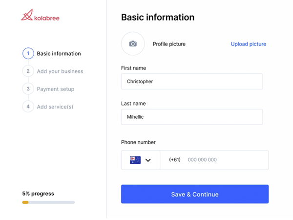
This last question is particularly important. Why? Because it contributes to a large extend to the success or failure rate of your process. Or, put differently, to user satisfaction, company reputation, trust, product use and eventually… product sales.
The above image shows a good example of how this is done. Almost 40% of available screen estate is used to assist the user in building trust and confidence.
The Action
Once the user has decided that the system he faces indeed meets his needs, the desire to do something will become almost unbearable. But…
- What? Where? How?
The interface should clearly communicate what actions are available, where they are located and how they are executed. This might sound easy, but many interfaces get it wrong. Let’s look at an example:

Where would you click here? Most likely you would think the bright and colourful ‘buttons’ are your go-to areas. And you would be wrong, as only the checkboxes are clickable.
Also, would you consider these four elements to be part of one item? Or would the amount of white space between them throw you off? Compare this example with the Kolabree image earlier, where good visual design was used.
System Feedback
Frankly, highly misunderstood by a lot of product design teams, system feedback is not what it should be on many products. Usually, the happy flow is so-so, but when it comes to non happy flows, things turn from bad to worse.
After the user has chosen an action to perform, the system will start doing its magic stuff. This could be where the user gets lost at once.
- Is the system doing anything?
- When will it be finished?
- Does it need my assistance?
- It looks like it is done, but is it really?
- Was it successful?
- If yes, now what?
- If no, what went wrong and what can I do next?
Any one of these questions screams uncertainty, let alone multiple of them at once…
Let’s look back at our hotel room light switch. You flip the switch to turn on the lights. In the good old days you heard that satisfying ‘click’. That’s feedback. The lights turn on, that is confirmation that your action was successful and your goal achieved.
But, what if the lights did not turn on? What went wrong? Lightbulb broken? Switch broken? What? This is why many of these light switches have an orange light for easy finding, that will turn green when the switch is on. Helps analysing the problem.
A good designed system will at any time provide signals about activity, success, and failure.
For digital systems this means, among other things:
- Progress
Systems that are not responding are becoming less and less frequent, but it still happens. The user should have some indication the system is working for them.- For short tasks a spinner is sufficient.
- For long tasks a (reliable) progress indicator is helpful.
- Unfortunately, spinners are used too often, taking away the mental mindset that a spinner means a short wait; now the user is left in uncertainty.
- Feedback
When the system is finished, it should tell the user. This could mean a simple message. Be aware it is a common mistake to require the user to confirm this message. That is a no-no. Display the message for a few seconds and then remove it, allowing the user to continue with his next task. Simple as that.
Now, what happens when things went poof? Feedback then becomes even more important and we will focus on that in just a moment. Unfortunately, developer teams hardly ever focus on this vital part of their application, which is why we, as designers, need to step in.
User Perception and Evaluation
Feedback will be interpreted and evaluated by the user and needs to be clear and concise.

Those green checkmarks send an important message: done with that, does not need my attention anymore.
The above message also shows another valuable lesson on the interaction cycle. There are cycles within cycles. Every step is treated like a cycle, but within a step there are micro interactions. After a field has been filled and checked, the small green line from step 2 to step 3 gets bigger, indicating another successful interaction with the system and providing feedback on success, progress, and the road still ahead. Simple, right?
When the user has evaluated his interaction cycle with the system, he will either:
- Continue with the next cycle if needed, to get one more step closer to his goal.
- Stop interacting, because his goal was reached.
- Stop interacting, because his conclusion was that thing would not end well, and he abandons the process.
As you can imagine, proper feedback for all three possibilities deserves an equal amount of attention during product design. Make sure each of them receives it!

Always keep in mind that one solution does not cover every scenario. I once was confronted with a team that wanted to celebrate successful completion of a online form with some virtual fireworks. Looked great.
While, depending on your target audience, this could be implemented when we know customers will only fill out that form once in a lifetime, it would be a bad idea for customers who visit the same form a dozen times a day to complete an order. It gets old pretty quickly.
Error Handling
Far too often the focus of development is on the happy flow, at best limiting error handling to showing a vague error message when validation fails. Good error handling is much more than that, and in many scenarios should take more time, focus, and attention than developing the happy flow.
Error handling is part of the feedback a system provides in the interaction cycle. For successful perception and evaluation, that feedback needs to be meaningful. This is where many systems already fail.

“An unexpected error has occurred” in a pop-up with only an OK button is a prime example.
- When is an error like this ever expected? Aren’t all errors unexpected? Or am I to understand that the developers of this product also have built in “expected errors” just to annoy me?
- When is it ever OK for me as a user that this error happened? Did I ask for this to happen? Was it part of my goal to accomplish this error to happen?
- What caused the error and what can I do to prevent it from happening again?
- Is this the best you can do for me? And you want me to continue my subscription to your product?
- etc. etc.
Besides improving the handling of errors such as these, there are numerous occasions where errors could be prevented. Instead, most product teams choose to ignore, or even blame the user. They forget that:
- In everyday life, everyday things are filled with mistakes. And we need to deal with these mistakes.
- Ordinary people sometimes simply don’t understand what it is we expect from them. They are not mind readers!
- People easily misunderstand wrong terminology / unfamiliar words or names, which causes them to, once again, not understand the current state of the system and what is expected of them next.
- People make mistakes due to bad visual design.
- People cannot comprehend what the system wants, due to use of poor, or even no conceptual model at all.
This is a massive topic, mixed with visual design rules, psychological and human behaviour theories. We will only be able to scratch the surface in this article.
Types of Human Errors
There are two types of errors we need to consider:
- The slip.
This is an error of execution. The user does something that he did not mean to do. This ranges from the accidental mouse click to typing errors, with a huge number of different types of errors in between. - The mistake.
This is an error of intention. The user does something that he/she thought was the right thing to do, yet it was not. In most cases this boils down to the user not being able to understand the right concept and/or system state. In many cases this can be improved by proper feedback.
The Learning Experience
Not all errors are bad. If handled properly, and this is a big ‘if’ as attention to errors from this angle is often non-existent, they provide a learning experience for the user.
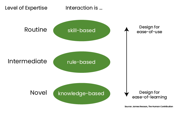
We can divide problems, and their errors, into three levels:
- Novel problems.
- These problems are ‘knowledge based’.
- There is no understanding (yet).
- People will approach these by trial & error if guidance is not provided.
- The focus should be on ‘ease of learning’
- Intermediate problems.
- These problems are ‘rule based’.
- No real understanding of the concept, but we manage by repeating what we have done.
- People will approach this like “if I do this, then that will happen”.
- Routine problems.
- These problems are ‘skill based’.
- A familiar problem will be handled in a familiar way, expecting familiar results.
- These are expert users, to whom any help we provide will be a nuisance.
- ‘Ease of use’ should be the focus; such as providing shortcuts and all that.
If you think about this deeply, you will understand that most systems should focus on novel users, and take the knowledge-based approach. Being built by domain expert developers however, many of these systems fall short of this requirement and end up at the other, wrong end of the scale.
Slips
Looking at the interaction cycle, slips only happen in the action stage. For instance:
- Nothing was done, within the time frame possible, and the system moved on (or reset itself).
- Not enough contrast between elements, lacking visual hierarchy, etc.
- Instructions are misread, due to misunderstanding of the conceptual model.
- The actionable area(s) is not noticeable enough.
- Cognitive overload is a common cause for slips.
- Stress leads to confirmation bias; people will fall back on what they know.

How can we reduce the number of slips happening, and help users recover from them?
- Make text, images, and concepts:
- Legible
- Enough contrast between text and background (also for the colour blind!)
- Leave the fancy gimmick fonts for your cat pictures Instagram.
- Meaningful
- Using ‘show’ and ‘view’ in the same application will cause confusion.
- Distinct
- Semantic analysis and card sorting should result in clear distinct phrases.
- Be conventional!
- Yes! Conform to what others do… it will look familiar to your users!
- Mouse / tapping areas should be large enough and well separated.
- These days, guidelines are everywhere from Apple, Google, Microsoft. Use them!
- Adhere to Fitts-law
- The amount of time required for a person to move a pointer (e.g., mouse cursor) to a target area is a function of the distance to the target divided by the size of the target.
- Take the test yourself: Fitts-law testing app.
- Don’t require unnecessary input.
- What people don’t have to do, they cannot slip up.
- Provide:
- Clear and instructive error messages; not just what went wrong, but also what to do next (and please try again is not sufficient)
- Undo functionality when possible and/or appropriate.
- Confirmation for important, irreversible actions.
- Legible
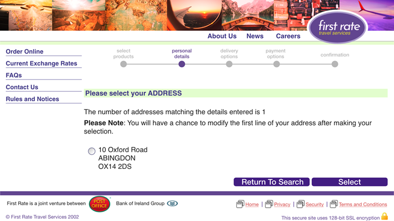
Why would you require a user to option-in a single address? Would it surprise you that many users did not click the option and just tried to click Select? And do we feel that this is the correct phrase for that button? At least make it something like “Select and continue to Delivery Options”.
Mistakes
Mistakes can happen anywhere in the interaction cycle and as such are a bigger challenge to manage. The common cause is feedback misinterpretation:
- User misses an audio cue, meant to draw his/her attention.
- Feedback with icons / symbols / visuals is not clear and distinct enough.
- Incorrect use of visual conventions.
- Think back on the address option in the above examples.
- Cultural differences.
- Checkboxes can have a cross, or a checkmark in them when checked.
- In some cultures, a cross means yes, but in others it means no.

How can we reduce mistakes made by our users?
- First and foremost: design for users, not functionality!
- It’s not about the technical requirements. No, it really is not. No matter what your devs are telling you, they are wrong.
- Through research we need to acquire knowledge on our target audience:
- Do they have all the skills they need to use our product and where do they need help?
- What terminology do they know and what do they call things?
- What are the mental / conceptual models they have of this process / product?
- What age range are we dealing with?
- Are there typical handicaps we need to consider?
- These are not just physical or mental handicaps.
- What if people in general are holding on to three things already when interacting with our product? Would that make a difference do you think?
- What if people are constantly alert for danger, or distracted by children?
- Consider a suitable range of user experiences.
- For instance: on a pension portal, the needs for a 25-year-old will differ greatly from those of a 55-year-old.
- You should not offer them the same experience.
- Be familiar with user goals and context of use.
- Context of use was already considered with ‘handicaps’ a bit.
- Within context of use, also consider requirements such as documents needed during the process; don’t dump that on your user halfway through the process, make sure they know up front.
- On long processes, allow for ‘in between saves’.
- Remember: novice users approach problems knowledge based. So, put knowledge in the UI!
- Avoid manual input of commands and use menus.
- People are much better at recognition than they are at recall.
- Use lists, not typed in value, but only for long lists!
- Do not use a list for simple number input.
- Do not use a list for simple date input.
- Make use of auto-complete in lists, combining type-in and lists
- Use constraints where possible.
- Radio button groups for single choice input.
- Checkbox groups for multiple choice input.
- Disable inappropriate choices/actions.
- Do not hide/reveal these as this will limit learnability.
- When disabled, people understand the option is not available yet, but might be in the future.
- Be consistent.
- Both within a single product and between products.
- Be consistent with similar solutions!
- Try to make sense of user input!!!
- Do not just scold users and demand re-entry! Do not make your user feel stupid!
- If you require a certain input format, tell the user up front!
- Remove spaces and punctuation before validation; it is just one line of code!
- Do NOT insist on leading zeros for dates and/or quantities. If you need them, code them!
- Allow space in entry fields for pasting longer entries and have the user adjust them.
- Avoid complex fields with unpredictable behaviour.
- Avoid manual input of commands and use menus.
Just as important is how we can prevent mistakes and help user recover from them:
- Use design models with simple, familiar concepts.
- Communicate these concepts through the interface, connecting to real world mental models.
- Put related features together.
- Create cohesion – card sorting will show what users expect to belong together.
- Design for interruptions.
- Mistakes often happen when users return to continue a task.
- Applications like Word/Excel allow for saving at any moment.
- When you open a document in Word, a tag appears asking if you want to continue where you left off.
Let’s look at two examples to finish this topic.
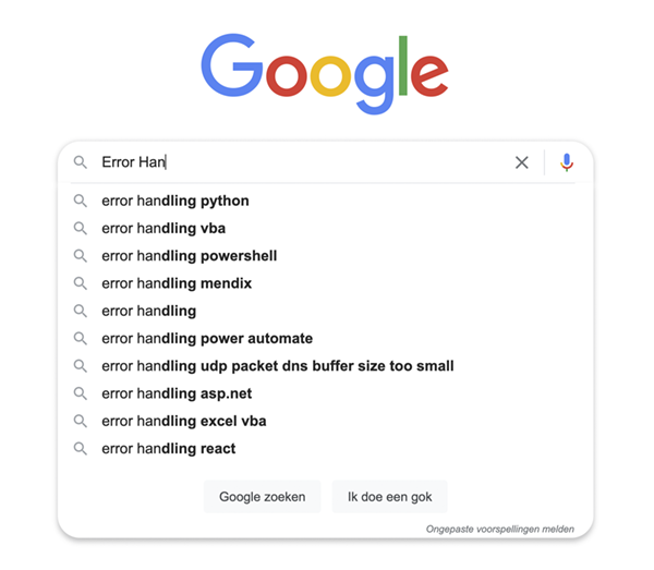
One of the least spectacular, yet most effective websites ever… Google Search. One simple entry box, but very effective, and they have the auto-complete nailed like nobody else!
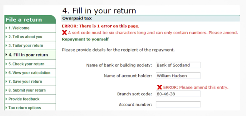
At the other end of this scale sits the Tax Services. In the UK the branch sort code is always written and printed in exactly the way the user entered it here. But the Tax Services does not want the dashes. Instead of handling this with a simple line of code, they bother the user with it.
Final Words
Pfew! We covered a lot of ground here and the post is a bit text heavy.
Yet, this underlines the importance of proper error handling. The happy flow takes care of itself. We need to take care of as many others as we possibly can. Only then will our users enjoy the experience they deserve. They will thank you for it by giving you and your products trust and confidence, which will translate into good, sustainable business.
Until next time!


