UX Strategy for Retail Store Chains
UX Guidelines – Accessibility Guidelines – Design Framework – Business Analysis – Interaction Design – Wireframes – Prototypes
Setting the Stage
“We are a worldwide retail multi-national and we would like to build our own software to be used by our employees!”
Well, that’s a rather ambitious goal. Let’s think about this for a second:
- Your core business is buying stuff from vendors and selling it for a profit to the general public.
- There are a lot of dedicated software companies out there, and none of them are good enough for you? (No!)
- This means what you will build must (!) be of a higher standard, or otherwise you would be better of buying anyway… (Yes!)
It was with this interesting challenge that we were contacted about two years ago, and when we laid out our strategic approach and ideas, the company involved made it clear to us they understood what the road ahead would entail, and that they were willing and able to travel.
Now, so very often I hear designers complain that they cannot maintain a portfolio, because there are NDAs in place. Well, not only did this company have an NDA, they also specifically did not want any reference to who they are (“only our own marketing department is allowed to publish about us”) in this portfolio article.
But, if you are involved in User Experience, this does not prevent you from telling a generic story. In this case about implementing a UX strategy, why certain approaches were taken, how you, as a designer or design team looked at problems you had to solve, etc. etc. All without going into specifics. All without showing one single design made for this particular company.
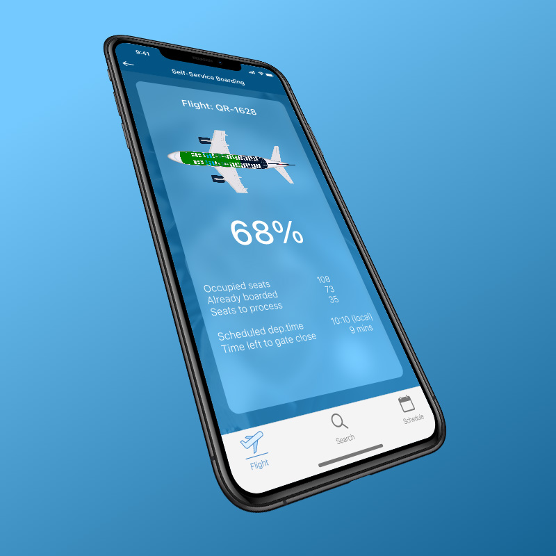
I will go one step further actually. Most images used in the article will be AI-generated as to prevent any relationship with real-world images. So, for both text and images my disclaimer is clear: any resemblance with real world entities is purely accidental and no conclusions may be drawn from this.
The Retail Landscape
")
Today’s modern, omni-channel, store environment is a complex organism that requires specific, specialist knowledge to master. Software applications each might excel in a certain area, but there is little to no guarantee they will blend and mix together into a digital landscape that will benefit the retail organisation, store employees, let alone the customer.
Many a digital transition has ended in tears, burning buck-loads of money, resulting in organisational management being wary and reluctant to collaborate with anything remotely related to the digital world. But, those same organisations cannot be left behind and know they have to do something if they are to survive.
It is here that (external) business consultants can play an essential part. They bring expert knowledge and previous experiences to the table that will not only help to prevent bad outcomes, but also speed up the transitional process. That is, if you are willing to listen, and allow them to deliver a return on your investment.
Well, as easy as that sounds… as was said before, many organisations have had bad experiences with external consultants and the first thing we must do is establish trust.

What NOT to do...
With new assignments like this, there are two tempting mistakes you should avoid:
- Make things too big.
Of course we see that our new client does not have anything in place to start producing high quality digital outcome. Even with their own IT department in place, having a developer moving a button in an existing layout, or changing a few labels here and there based on some rough sketches in Powerpoint, does not equal the necessary process from requirement gathering, all the way to front- and back-end specification.
But talking about enterprise wide transitions is just about the worst approach you can take here. The subject matter will be unfamiliar, it will involve change, and both will overload your target audience, completely missing the mark. - Make things too small.
Of course we are eager to lead by example. So we bring in an agile design team running two week sprints. We invite all involved stakeholders to the review and we quickly start showing them progress; after all we need to justify the invoices we send as well.
First review… look, color definitions… second review… ah, yes, typography and why it matters… and by the time we have arrived at our sixth sprint review we wonder why the room is empty…
Hitting that Sweet Spot
Your first goal is to gain traction. Get them onboard. Sponsor the fact externals are adding value. And for this you need to show value!
How? Well, start by listening. Where are their pain points? Ask the right questions. Then make sure your message confirms what you have learned. A few random examples:
- Retail stores in general have a low retention rate. Hence, onboarding is important, but with minimal staff available, there is a lack of time.
- Current implementation of mobile operational apps has not been very successful for various reasons.
- While business units might provide hardware handhelds for now, one wonders if employees would not be happier using their own mobile devices?
(A watercolour painting? Seriously? Yup! Told you the images would be largely unrelated to the story.)


Design Guidelines & Basic Frameworks
So, how do we deal with these… and how does it affect our design strategy and decisions?
- First and foremost, what we need is adoption. Nothing else matters, but adoption!
Employees should be able to pick up a handheld on day 1 and learn a task, within an hour, without assistance. That severely limits your design options, as in, available functionality can not be hidden! No fancy sliding or otherwise ‘need to know’ / ‘need to discover’ patterns. And yet, you still need to be aware of cognitive overload. - Things should look familiar.
Basically, adhere to the popular brand guidelines and don’t deviate. For us this made the set-up of the initial framework actually pretty simple. Android should look like Android, basic Google Material Design V3 was all we needed. Hamburger Menu, Floating Action Button, and all that good stuff. At the same time, iOS should look like iOS. With all the features that come with that. And for larger screens, just stick to familiar principles found in email clients and what not.
Putting those basic frameworks together could be done quickly and resulted in stakeholders getting enthusiastic as they started to envision where this was going.
Everything is a Trade Off
“We need a mobile POS on the handheld and we want this to look like the normal desktop POS, as this is familiar to the employee!”
Great stakeholder input, communicating their best intentions to stick to the guidelines we had put together.
But, let’s look at this a bit closer… we are looking for adoption. Employees should switch from sending customers to the normal line in front of the POS, to handling that transaction on a much smaller, less comfortable to work on, screen. If everything else is the same, the large POS will remain favourite.
For these situations you should include a few ‘transition requirements’. Incentives that will encourage adoption of the new handheld POS.


Business as Usual
Our first practical goal was to digitise existing store tasks. This meant analysis boiled down to internal company knowledge on how operations were run, and transfer all that into a neat digital solution, keeping all guidelines in mind.
While, as designers, you would love to spend time inside stores to observe and interview employees, the set timeline and overall attitude of the client meant that we slowly but surely had to introduce this way of working. In line with was said earlier, sometimes you need to settle for something being better than nothing. While working with focus groups largely occupied by middle managers, with ‘design by committee’ being a notable risk, you need to accept this phase as one more step on the learning ladder.
With numerous business units each having slightly different ways of working, we chose to analyse for a ‘baseline feature’ first, only to have individual units polish each feature as desired, adding their own specific needs where necessary in later stages.
As we made sure the baseline features were not only fulfilling the above stated requirements, hence adoption was happening at a nice pace, in many cases it turned out those ‘specifics’ in the end were not important enough to warrant additional development costs. By making sure using the features was good enough an improvement, we were able to move forward and complete the operational framework.
Measure Everything
As part of our initial guidelines, and partly to counter the downside of ‘design by committee’, we had stressed the importance of gathering usage data, both qualitative as well as quantitive.
Essentially you want to know three things about your digital solution:
- Effectiveness
How accurate and thorough are the goals achieved? - Efficiency
How much effort does it take to achieve a particular goal? - Satisfaction
Which is a subjective measure of reflection on solution usage.
A few examples of what kind of measures we would be looking for are:
- Time on Task – measures the efficiency and productivity of the product.
- Average Time Spent on Task – regardless whether successful or with errors.
- Mean Time to Failure – as in giving up the task, or completing it with errors.
- Average Task Completion Time – as in successful finishing the task.
- Errors – measuring the number of specific errors within a task. See my blog post on Error Handling for more.
- Completion Rate – measures how often users are able to successfully complete the task.
- Usability Problems
- Users selecting the wrong link / button / option to continue the task at any given point inside the task.
- Users misunderstanding content / instructions.
- Users express frustration.
- Users miss out on functionality offered within the features / tasks.
- Users fail to complete the task due to system behaviour.
- Users misunderstand when a task is completed.
- Task Satisfaction
- Five-scale range
(Very Dissatisfied – Dissatisfied – Neutral – Satisfied – Very Satisfied)
- Five-scale range
While measuring usage through clicks and A/B tests will be done in live environments, many of the above are better performed in focussed user test situations. Based on the results, better design decisions can be made to move the product forward beyond the initial stages.


What's Next?
All the while our attention stayed focused on also improving the process of feature development. With more and more knowledge gathered by the organisation, more opportunities presented themselves to introduce new ways of working, better deliverables to support the process and thereby both velocity and quality of the product delivered.
An interesting dynamic popped up, as new ideas were presented by stakeholders, that, while by themselves pretty good, moved away from the basic principles focused on adoption and simplicity. Without signals from users it would be too soon to introduce changes in the interaction design language.
For instance: only when user feedback came that ‘there are too many icons on the product cards’, time was right to start hiding certain less used functionality. With users being aware that the functionality was there, it was safe to do so. Doing that at an earlier stage would be premature and carry risks such as mentioned in the measuring paragraph. Learning how to walk this fine line was just part of the learning process.
It was here that we could safely say that maturity was such, that as external design advisors we could lean back and start moving away.