Aegon Advisor Portal Structural Redesign
Research – Information Architecture – Interaction Design – Wireframes – Prototypes – User Testing
The problem we were solving
Aegon maintains a portal for independent financial advisors to use for their interactions with the company, as part of a digital transition to provide efficient self-services.
This portal had been growing rapidly over the last couple of years, which meant structural integrity had taken a downfall. Quick implementation of new functionality took preference over making sure that functionality was available to the user in a well structured manner.
Essentially, satisfying the internal stakeholders was deemed more important than satisfying the needs of the user. It happens.
Understanding the problem
Just as with the analysis of the existing Product Detail Page, we had to start by taking a critical look at what was in place and why.
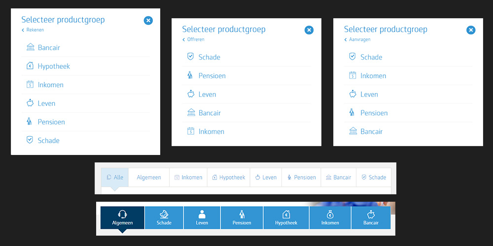
At some point Aegon decided that navigation had to be based on activity. For instance, top level navigation focused on “calculation”, “offering”, “requesting” a product. Research showed that this was not the way the user approached the portal. They would primarily focus on a business line, for instance “mortgage”, “pension”, and “insurance”.
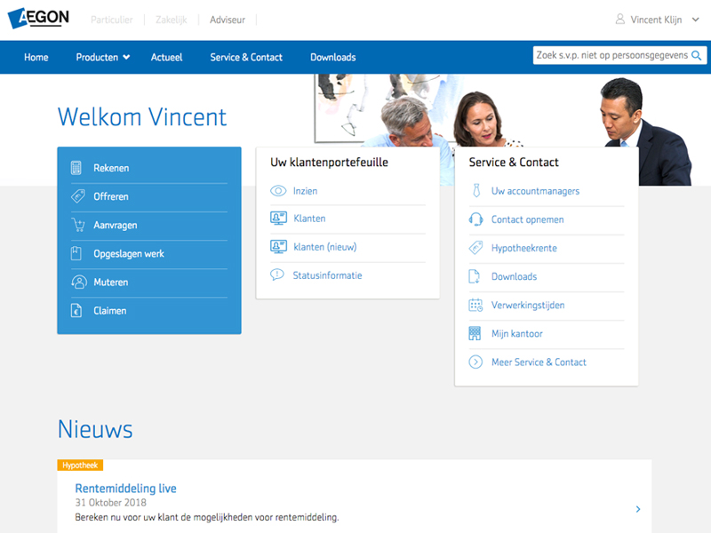
Top level navigation was put on the homepage only, in boxes and pop-ups, which lead to some strange user behavior. The inability to quickly go from one functionality to another forced the team to introduce a feature called “favorites”, so the user could easily switch between tasks. A red flag by itself.
More Problems to Understand
Research among users revealed that awareness of the possibilities the portal offered was quite low. Users knew a few routes to do things they knew could be done, but were never triggered to expand on their knowledge (and who can blame them?)
This meant that available self-services were not used enough and did not lead to the desired load reduction on the Aegon Service Desks. Au contraire…
The Service Desks received several thousands calls a week concerning basic navigational questions. Members of these desks suffered from the same issues the users did though. This lead to some interesting, yet wrong myths on how functionality could be reached.
Finally, as can be seen, the navigation was rather inconsistent on different levels. For instance, the order in which the business lines were shown was different on every occasion. This reduced learnability to close to zero, and made users look for the textual label over and over again, as opposed to remembering where the desired option was located.
First Steps
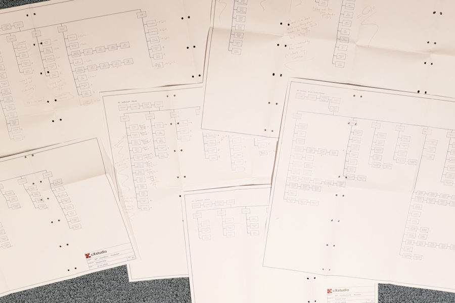
Because of the value-stream set-up and various team organization, nobody could tell me what features were available in the current version of the portal, so my first task was to map out all functionality. This resulted in over 180 links found within the application and several huge site-maps.
Next, I started looking for duplicate links. This lead to the surprising conclusion that almost every feature was linked to from at least three different locations. Reducing this number of links alone would result in a much easier application structure.
Let's ask the User, shall we?
I know, it is a revolutionary concept. Interviews, small-rooms, and a dedicated test center allowed us to gather lots of data on what the financial advisors were looking for.
It became apparent that the functionality that was used the most by far, was searching for a specific customer to either look up information or make some changes to policies or other data. While this was all possible at the time within the portal, the functionality kind of was buried with the mayhem of links.
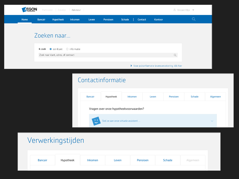
Therefore, we made the choice to present the customer search functionality right at the top of the homepage, therefore becoming the most prominent content component. When we presented this to our audience as a prototype it was received with great enthusiasm and so we knew we were on the right track.
A second finding was that, on average, the time spent logged in varied between 30 seconds, to 2 minutes. What did that mean? Well, the advisor logs into the portal with a very specific goal in mind; nothing should distract him from achieving that goal. No marketing messages, no news popups, nothing. Treat the portal as a software application, not an ecommerce website.
This was also reflected in the findings related to the existing forms. Most of these were set-up like you would set-up a consumer journey; small steps with lots of explanations and guidance. However, an (assistant) advisor who knows what he or she is doing and has filled out that same form dozens of times, just wants the bare essentials to fulfill the task at hand. Preferably, one screen and one screen only!
Back to Basics - a standard horizontal menu
This was not a visual design project. Basically, we would respect the current format. Of course we did introduce some small changes where we felt they were really needed, but overall we left the rather classic format alone.
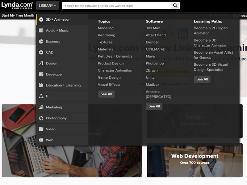
Before I was able to reduce the number of links by 65%, I was looking for a “fat menu” such as Lynda.com or Amazon.com. However, after the clean-up it was obvious this was not necessary just yet. At least, with the possibility to expand the menu towards a real fat menu, Aegon was safe for many years to come.
For now, the menu would be quite lean and basically, for each business line, all functionality could be included in just one level of navigation.
Everything just one click away, there is your marketing tagline right there.
Expand on the Basics - consistent approach to navigation
With six business lines being present on multiple locations within the portal, it is important to present these business lines in the same order at all times.
With this I introduced the concept of “learnability” within Aegon digital solutions. Over time the user won’t look for the textual label anymore, but will have remembered the location where to click. Not only will this reduce his time-on-task, one of the most important metrics our users were looking at, it will also increase trust and brand awareness.
To Iterate or not to Iterate
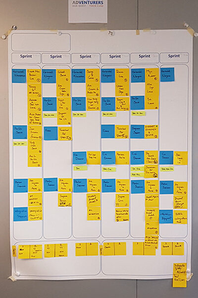
Modern software development is all about agility and making quick, bite-size iterations. And so we planned the implementation of the new navigational structure likewise.
But, when we went to our target audience with this plan, they made it clear that this was a bad idea. And with good arguments.
So, in the end, we “iterated” several sprints up to our UAT environment, and then, one beautiful Monday morning, we pushed it all live. Well, actually, we first pushed it live to a small selected group of advisor firms, and after that went well, we pushed it live for everyone else.
Most important, and in fact a good agile approach, was to change our initial plan and adjust to what our customers wanted.
Communication
Launching such a big re-structuring needs good communication. Both internally and externally.
- Demos were given.
- Walk-in sessions for the Service Desks personnel were set-up.
- Newsletters, emails, notifications, and all that good stuff was sent to the users pro-actively that a new navigation was coming.
I have to say that a lot of people within Aegon worked really hard to make this launch a success.
Quantification
Often overlooked, but in fact not only quite simple to do, but also important.
After the introduction of the navigation, we soon saw a significant drop in calls to the Service Desks. We are talking only about calls concerning navigation and such things as “unable to locate a service”, or “does not know a service is available”.
Based on this we could calculate the benefits. Now, of course, due to non-disclosure agreements in place, I cannot get too specific here, but the ballpark figure speaks for itself.
Calculating with 48 working weeks a year, we arrived at a total saving of €192,000.00 / year.
Final Words
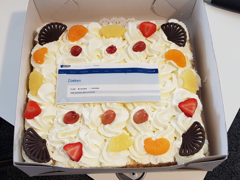
Combine this with the goodwill and reputational gain this new navigation delivered, and we can safely say the cake offered on the day we were finished was well deserved. A nice touch was the customer search bar decoration, a testimony that Aegon appreciated the research we had done and the results it brought.
This was an interesting project, rewarding in both the result and the challenging road to get there.
