Topseller.com Product Details Page Redesign Part 2
Research – Interaction Design – Wireframes – Prototype
The problem we were solving
In preparation for some talks with this company I was asked to take a critical look at their Product Details Page (PDP) and do a redesign of it, applying best practices.
This is a two part series:
- Part 1 of this project deals with the analysis of the existing page and research on the subject,
- Part 2, this part, handles the actual redesign; the moodboard, the wireframes, the prototype and all that good stuff.
We did a lot of research in Topseller.com – Product Details Page Redesign Part 1, which has given us information on best practices and how to design a good product page. It’s time to put all this in practice by coming up with a redesign for the Topseller.com PDP.
So, without further delay…

Assembling a moodboard
The moodboard was generated by collecting all elements from the existing page:
- Colors – I hardly ever recommend using pure black (#000000) but instead opt for #333333.
- Fonts – “Work Sans” was used but I increased the sizes conform what I found on the Canadian site.
- Logo’s – nothing for me to do there.
- Icons – I carefully collected all of them and did some restyling here and there.
Sketch of the new content hierarchy
In my opinion the Dutch department of Topseller.com would do itself a favor by getting more in line with the design concepts used by other countries. Uniformity is bliss. And it makes design decisions a lot easier.
This sketch of the global content hierarchy represented that attitude:
- We conformed to a two-column structure.
- The header included search functionality conform accepted best practice.
- The image gallery remained where it was; no reason to change that.
- The description area stayed the same, with two points of attention: better copy and the introduction a social sharing hashtag.
- The shipping and delivery area would come below that.
- A cross-selling area below that, with the sidenote that this should be real cross-selling.
- Footer remained where it was, not surprising…
The right column contained two areas by itself which move up and down when the customer scolls; this ensures the CTA remains in full vision at all times.
With the global locations in place, let’s look at each of these in more detail…


The header section
The header section became rather standard for an ecommerce product page. And “standard” here is good! Don’t make your customers think; build trust and keep the learning curve as low as possible.
- The top bar is all about brand selection on the left and the user account on the right.
- The bar below that can be used for a slogan about free shipping and all that good stuff.
- Breadcrumbs, main navigation and search make up the remainder of the header.
Image gallery
Nothing too fancy here, layout and functionality of the image gallery was to remain the same.
I wanted to make one point about the content though. A good gallery is not just a bunch of images of a product. A good gallery has a series of images, each of which provides new information to the customer and as a whole paints a strong image of the product.
It pays to work with photographers who know what it means to create “series” of images as opposed to just shooting a bunch of unrelated pictures of the same product. Careful selection will pay dividend in the long run.


Extra info and CTA section
Arguably one of the more important sections of a product details page.
The size selection has an indication whether or not a certain size is in stock. And below that section is a piece of micro copy that stated that out of stock sizes will be back soon.
Below the CTA there is clear information about shipping, delivery and return policy. Proximity matters!
And because we moved that information to this section, the “S&D section” became obsolete and we could replace that with a newsletter sign-up form.
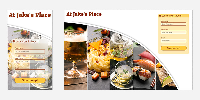
Newsletter sign up form
Keep the form simple and easy to use.
One point of attention: the original Topseller PDP also had a sign-up form. The copy above that form had a font-size that was by far the biggest on the whole page. Ask yourself: what is the primary function of your PDP? Is it to get people to sign up for your newsletter, or is it to sell stuff? That will tell you which pieces of copy are more important than others and which should draw the most attention.
For a more in-depth view click on how to design a newsletter sign-up form, which takes you to another portfolio project.


Footer section
We were not going to change too much on this section, other than bringing it more in line with the other countries’ sites product page.
This meant one change: provide contact information at the bottom. I was surprised the Dutch version did not have this in the first place; a major trust builder. Customers hate companies that hide behind large walls; bring these down and be approachable.
Wireframes Step 1
Paper wireframes? We need no paper wireframes? We live in modern days now and everything goes digital!
The usefulness of wireframes is often underestimated.
The wireframe shown here is used to determine content hierarchy. Don’t think you and your design team will always know what information matters most to your audience.
- Would it surprise you that “product information” often is more important than the “image gallery”?
And this weighs heavier when we consider that “product information” now sits below the fold. - Would it surprise you that “product information” often ended up in the right column, above “price/color/size & CTA”?
Now, of course we wanted that right column to only hold the “price/color/size & CTA” section, so it could slide up and down, but the information provided by testing the hierarchy with just a few customers provided valuable insight.


Wireframes step 2
Here, more detail is offered to see whether the lay-out will still be pleasant.
The backside of each element held its name, so the customer could still identify what was what. With this test we were looking whether or not more detail would change any priorities for the customer.
Why not do this in one step?
Because providing more detail in a mock-up will lead to a shift in emphasizes on what the customer will talk about.
In the first stage we were not interested (yet) in sizing of areas and fields. We were only interested in where stuff should go.
In this stage we were interested in how well balanced the different areas were perceived by our customers. By the way, each of these areas can now be turned into a design pattern and before you know it, we are talking design system…
Prototype header section
On the Canadian page I noticed the possibility to quickly switch from one brand to an other. That functionality was integrated in the new design.
The product selection section uses grouping and whitespace to present the information in a logical fashion:
- Product name and brand.
- Price and discounted price (when applicable).
- Color and size selection (notice the microcopy explaining the cross-out functionality).
- Number purchased, call-to-action, shipping information.


Prototype product description section
The copy should be changed; that was not up to me.
This design pattern consists of three items:
- The description copy.
- The size table.
- Social sharing (implementing the unique product hashtag).
Prototype cross-selling section
Cross-selling is done through an area that presents four additional products. The selection of products is important. Let’s look at a salesperson working in a B&M store…
So, you are in a clothing store and have selected a jacket you really like and are close to purchasing. What should the salesperson do?
- Offer you four other jackets, similar to the one you are interested in?
- Offer you four additional products that would go well with the jacket you like?
Not just from a customer’s point of view, but also from a retailer’s point of view, we feel the second approach is best.


Prototype footer section
Offering a newsletter sign-up should come across as an additional feature, not as pushy. The requested information should be limited as much as possible.
Why would you want the customer’s name? I know, to personalize the newsletter. But when a customer has not yet created an account at Topseller.com, why not settle for a generic header and just ask for the email address. The personalization will come once the customer has made a personal account.
Comparison between the two designs

You be the judge, which design do you like better, the original on the left, or the proposed redesign on the right.
This was quite a long journey, but I hope you found it interesting to see how this process works.